About Gini’s Brand
Gini is a workflow management solution startup specifically crafted for travel agencies, co-founded with my colleague. helping them streamline operations and boost efficiency. As a brand that bridges technology and the travel industry, Gini required a logo that was not only modern and sleek but also professional and versatile.
Core Values of Gini:
- Innovation: Simplifying complex workflows with smart, easy-to-use tools.
- Efficiency: Helping travel agencies save time and manage tasks seamlessly.
- Professionalism: Providing reliable and professional solutions for the travel industry.
These values guided every step of the design process, ensuring the logo would resonate with travel agencies while standing out in the tech landscape.
Design Concept
The Gini logo needed to achieve the following:
- Modern Appeal: Reflect Gini’s tech-forward nature.
- Industry Connection: Directly connects to the travel industry.
- Clarity: Be simple yet recognizable at various sizes and on different platforms.
Typography
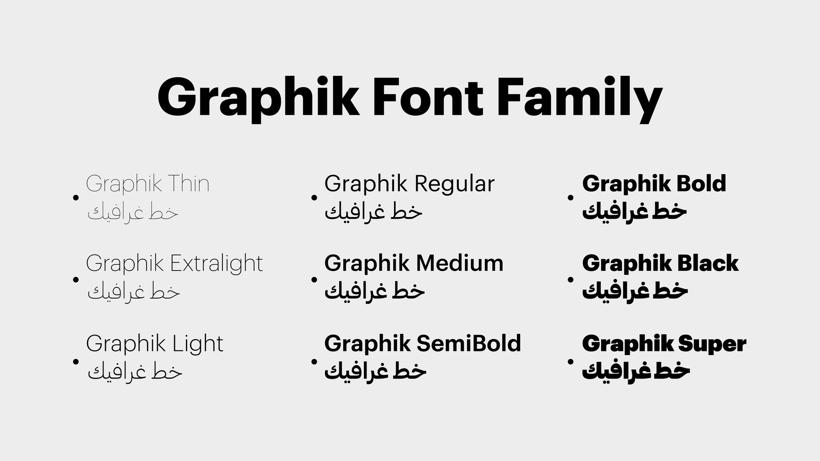
- Clean lines ensure readability across all sizes.
- Sharp edges add a sense of approachability while maintaining a professional look.
- Support both Latin and arabic charcters.
Color Palette
Colors are powerful in setting a brand’s tone and building recognition. For Gini, I chose a palette inspired by:
- Trust
- Efficiency
- Travel industry
Logo Applications
On Desktop:
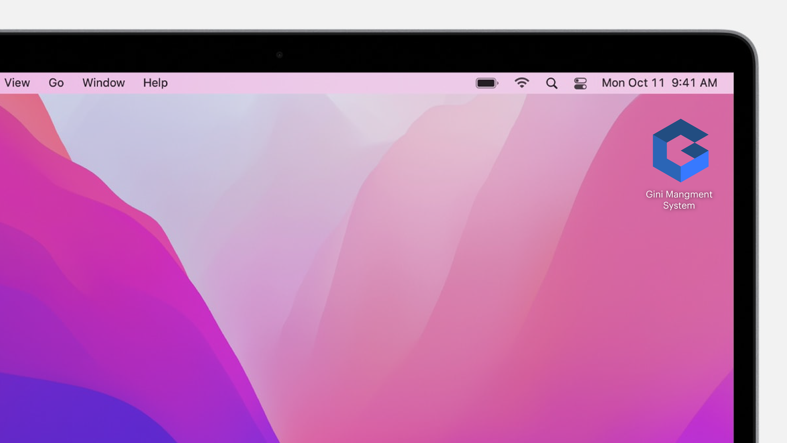
The logo integrates perfectly with the Gini desktop app, appearing sharp and professional even in small formats like icons.
On the Website:
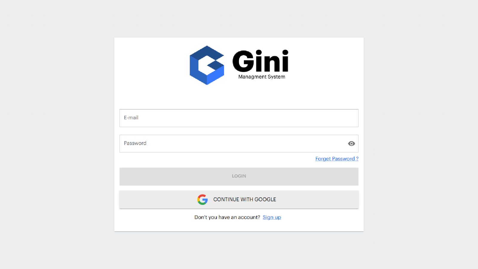
Designed to be responsive, the logo adapts beautifully across screen sizes while maintaining its clarity and aesthetic.
In Marketing:
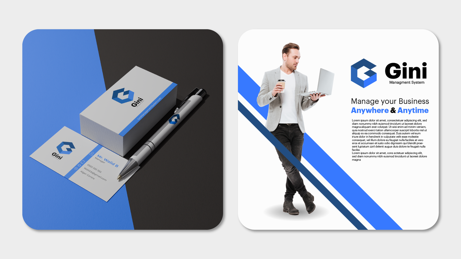
Whether on business cards, banners, or presentations, the logo enhances Gini’s brand presence, giving it a cohesive and professional identity.
The Value of the Design
The Gini logo is more than a visual asset. it’s a tool for communication.
- Industry Connection: The geomtric icon ties directly to travel, helping establish trust with agencies.
- Brand Recognition: Its simple, clean design ensures memorability and consistency.
- Professional Appeal: The modern typography and color palette exude credibility, reinforcing Gini as a reliable partner for travel agencies.
Team Feedback
As both the designer and co-founder of Gini, I worked closely with my team to refine the logo. Here’s what they said:
“The logo perfectly captures our vision for Gini. It’s clean, professional, and resonates with the travel industry while feeling innovative and fresh!”
Conclusion
The Gini logo is a cornerstone of our brand identity, representing our mission to simplify workflows for travel agencies. With its modern design, thoughtful typography, and versatile color palette, the logo sets the stage for Gini to grow as a trusted name in the travel tech space.
If you’re looking for a custom logo that speaks to your brand’s values and stands out in your industry, contact me. Let’s create a visual identity that takes your business to the next level.
